 Image 1 of 1
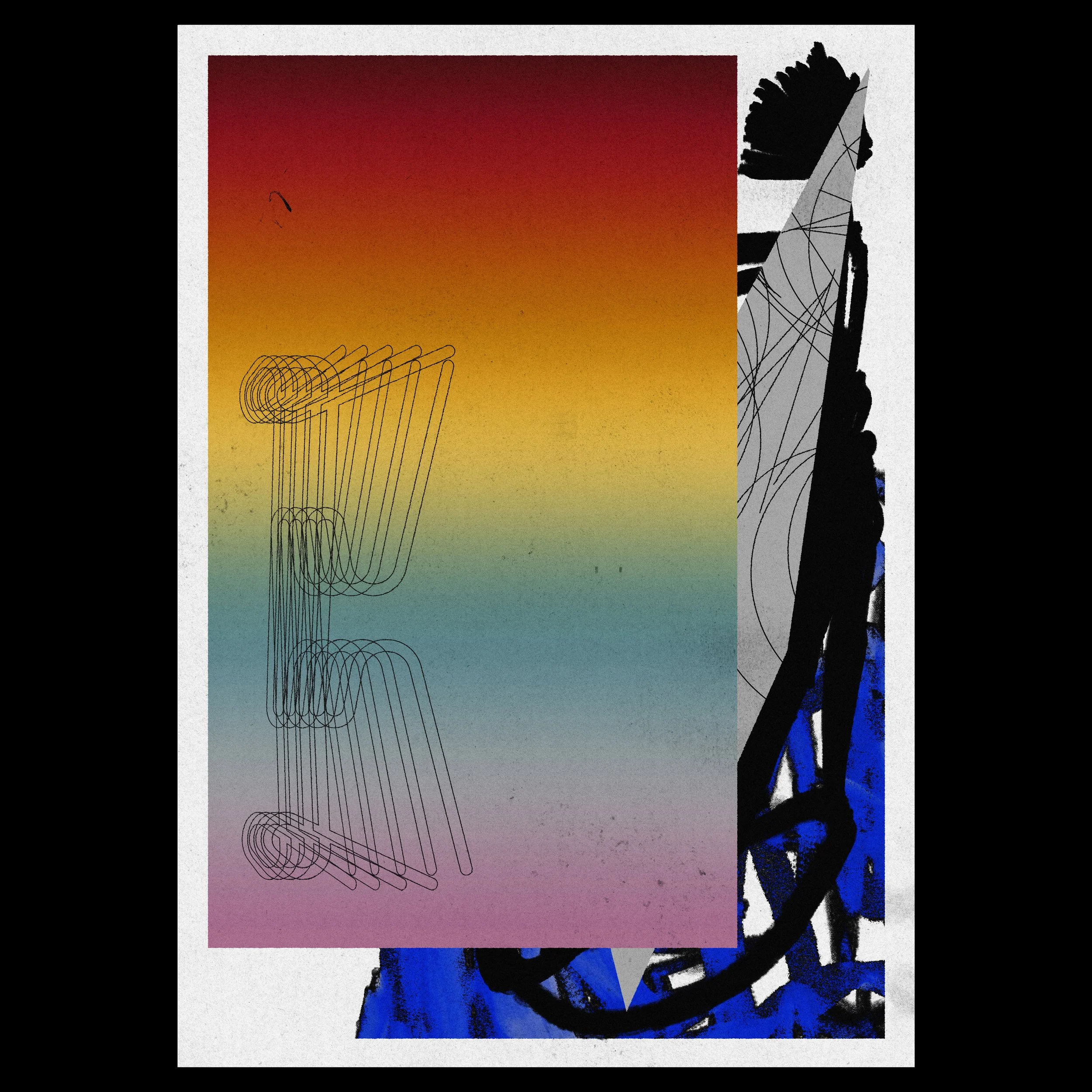
This composition presents a vivid contrast between structured, mathematical repetition and expressive, gestural marks. It explores the tension between a defined gradient field and the chaotic, shifting textures that lie beneath and beside it, suggesting a search for form within a busy environment.
Colors: A vertical gradient of deep crimson, honey yellow, and muted teal transitioning into lavender, set against a background of cobalt blue and solid black.
The Look: A central rectangular color wash featuring a repeated, wireframe "E" or "K" shape, bordered by thick, ink-like brushstrokes and a gray triangular wedge filled with delicate linework.
Texture: A heavy, speckled noise over the gradient and a raw, wet-ink feel on the blue and black segments that provides a high-contrast, tactile depth.
Text: Discreet "OSAKADOSAKA" branding and the title "WHAT IT ISN'T" in small, clean type positioned near the bottom margin.
The print offers a bold and energetic presence that acts as a compelling focal point in a modern studio or living area. Its combination of digital precision and organic, expressive movement creates a sophisticated visual balance for a contemporary interior.