 Image 1 of 1
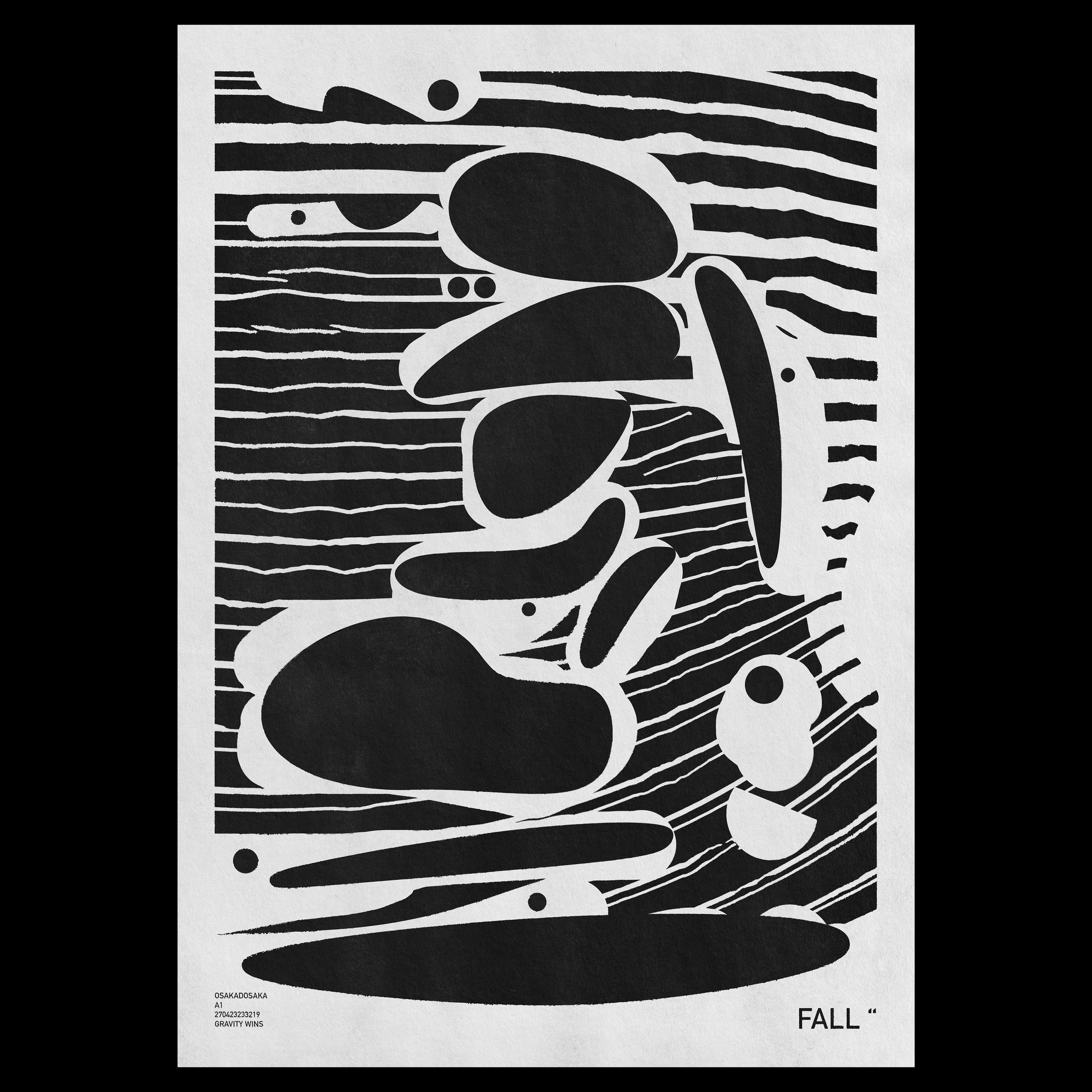
A simple, high-contrast study on balance and movement. Titled FALL, this print uses heavy, pebble-like shapes stacked against a background of irregular horizontal lines to create a sense of weight and gravity.
Colors: A stark black-and-white palette.
The Look: A mix of solid, rounded organic forms and thin, hand-drawn lines that give a vibrating effect.
Texture: A noticeable paper-like grain that keeps the bold black shapes from feeling too flat or digital.
Text: Features the title "FALL" and small technical type in the bottom corners including the phrase "GRAVITY WINS."
A straightforward piece that brings a strong graphic element to a wall without needing color to make an impact. It works well in a hallway or as part of a larger gallery wall where a bit of contrast is needed.